We've completely redesigned the interface to make it faster, more modern, and easier to use. This guide highlights the key improvements you'll notice in the latest version compared to the legacy system.
1. A Modern, Clean Look
The application has moved away from cluttered, old-school designs to a more professional and readable look.
- New typography: We now use the Lato font, which is clearer and easier on the eyes.
- Professional colors: The palette uses consistent blues and grays that look great in any office environment.
- Dark mode: You can switch to a Dark Theme to reduce eye strain in low-light environments. This theme applies to everything, including charts and maps.
- Spacing choices: Choose between Comfortable (more room) or Compact (more data on one screen) views.
2. Improved Navigation
Finding your way around is now much simpler thanks to a redesigned menu system.
- Fixed sidebar: All your main tools: Reports, Analytics, Admin, etc. are organized in a permanent sidebar on the left.
- Clearer icons: We've replaced old images with crisp, modern icons that look sharp at any zoom level.
- Smart highlighting: The sidebar clearly shows which section of the app you are in.
- Easier alerts: Warnings and alerts are summarized in the sidebar with color-coded severity (Yellow, Orange, Red).
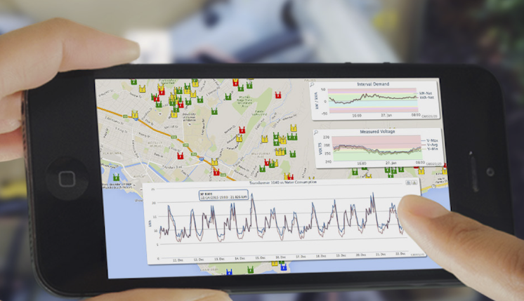
3. Better for Mobile and Tablets
The application now works on tablets and smartphones.
- Responsive design: The layout automatically adjusts for your screen size.
- Hamburger menu: On smaller screens, the sidebar tucks into a menu icon to save space.
- Mobile filters: On a phone, search filters collapse into a "Show Filters" button so they don't block your data.
4. Consistent Tables and Lists
No matter which page you are on, the data lists now look and behave the same way.
- Standardized grids: All tables have alternating row colors and sticky headers (the top row stays visible as you scroll).
- Unified filters: Searching and filtering is consistent across every page, with clear labels and easy-to-click buttons.
- Map enhancements: The map has a dedicated sidebar for filters, a clearer legend, and improved controls for touchscreens.
5. Under-the-Hood Performance
You'll feel the difference even if you don't see it.
- Faster loading: The header and sidebar appear almost instantly while the rest of the content is prepared.
- Smarter redirects: We've fixed issues that used to cause looping screens during login or session timeouts.
The goal of these updates is to provide a more intuitive and efficient workspace. If you have any questions about the new layout, please contact support.